Thursday, March 8, 2018

CSS and CARP Design

CSS and CARP Design

Overview

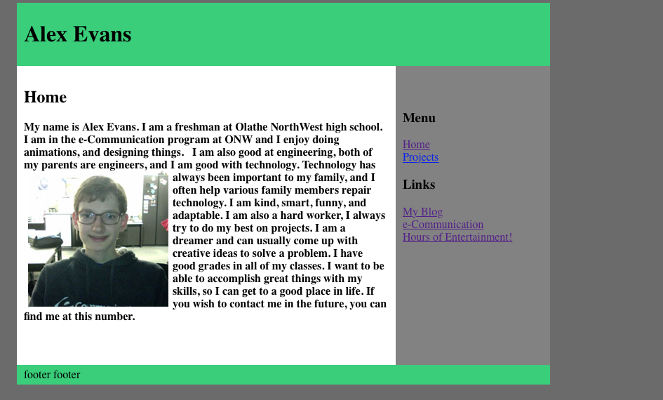
In this project, we redesigned a website. We were given a starting website and with help from some instructions, we made it look better. We started by opening the project in Adobe Dreamweaver. We followed a list of things we needed to change to improve the design of the text, picture, and website. The final product of the website looked much nicer and more organized than the original website. 

Contrast

I improved the contrast of the site by changing the color and bolding some of the text. This made things like the title and first line stand out more. I also changed the font of some of the text, also allowing it to stick out. 

Alignment

I improved alignment by moving all of the text to the left and moving the picture to the right. I also centered the title and subtitle. This alignment gives them more contrast. 

Repetition

I improved the repetition by making all of the paragraphs the same font, size, alignment, and color. This made the website look much more appealing. 

Proximity  

I improved the proximity by increasing space between lines. I also increased space between the text and the picture. Spacing out the text makes the page look nicer and helps certain things stick out. 

What I learned

Throughout this project, I learned a lot about how to use Dreamweaver and how to mess with code. I enjoyed this project because I have always enjoyed messing with code. I enjoy reprogramming the Google search engine to have a different logo and different text, however it resets, while Dreamweaver encourages me to change the code!


Thursday, March 1, 2018

E com Personality test


Personality Type

The personality test said I was 44% an introvert. I think that is mostly true since I have trouble talking with other people and basically spend all of my free time by myself. I feel like I would be less intuitive because I tend to use the logical point of view, however, I also tend to use information I find outside of my conscience. I agree with being a low percent of feeling, I always try to think about what I should do in certain cases instead of going with my gut. I also do like to judge over perceiving. 

Understanding Myself

My personality type does explain who I am fairly well. I'm an introvert who likes to understand the concepts of life. It explains why I gravitate toward video games over social interaction. I have never liked going out in public, so I basically stay inside whenever possible. Plus I am really bad at talking with other people. 

With Other People

My personality type explains me in group work as well. I have never been good in a team with people I don't know or barely know. However, the project allowed me to talk with other people, mostly about how some famous people that shared my personality type were Hitler and Mohamed Atta. So possibly not the best conversation. I always try to work well with y team in school projects, but if I am not in a group with people I know really well, it doesn't go too well. Outside of school, I am even more of an introvert. I basically stay on my computer and play video games by myself. 

My Personality With Others

I am usually considered to be a nerd and someone who stays away from the action. Probably because I am that kind of person. my personality type proves it! Usually, people's first impression of me is "weird". This is usually what people think of me forever. Those people misunderstand. I would like to say I am normal, everyone is weird in their own way. I tend to get along with everyone I meet, so I have never had problems with people of opposite personality types,. In fact, one of my best friends is an extrovert. 

Learning about Myself

This project has made me realize I am much more of an introvert then I thought. I knew I was an introvert, but not 44% of an introvert. I would have guessed I was about 30% an introvert. When I think about it it is not too surprising. 

Lion/Otter/Bever/GoldenRetriever

The second part of this project determined what animal we were like. After taking the test, I found out I am like a bever. I am organized and I think there is a right way to do everything, just like a bever. I think a bever sharing the same personality as me works well. 


Thursday, February 15, 2018

e-com AB sequence


AB Sequence

Project

In this project, I learned how to better camera shots. My partners and I started out by deciding what idea we wanted to go for. Eventually, we decided to go for a Misson Impossible type video. I was decided to be the main actor. 

Editing

Through the editing process, I had to trim all of the scenes. Many started way too early and ended too late. That wasn't a problem. I cut all of the background sounds from the recordings and added in some royalty free Mission Impossible music. 

The Video

Our plan was to start with an establishing shot, go to some scenes of me sneaking past the first two security guards, and exiting the building, which we ended up doing. Along the way we left a few scenes the way they were for comedic effect, for example, it's pretty hard to roll on a tile floor without hurting your head, I started the roll weirdly but instead of trying to fix it we left it in for comedic purposes. 

The Team

The people that helped with the project were a massive help. They knew a lot about camera work and had a lot of good ideas for the video. They wored well with me and I think we had a pretty good final produck of every scene. Next time I would like to incorperte more of their ideas. We never recorded a few scenes because we didn't think they would fit. However nowI would like to try to add them in. 


Monday, January 29, 2018

e com How to print video project


How to Print

Creative Process

        Starting the video, we had the idea to make a humorous video, but since that wouldn't be professional we decided not to. We went through many different ideas, like who would record what scenes, who would go to the library to get the paper, and who would print. 
Key decisions were made by popular vote and how professional it was. Each one of us had an idea for at least one scent, and how to improve other scenes. 

My Role         

        During recording, I sat at the computer for the second scene and printed the paper for the third scent. After that I just recorded the scenes. Along the way I learned more about recording and how to level a camera. I also learned how to use Adobe Premiere. I made sure to communicate with my group so we all agreed on the decisions that were made, and I made sure to step up and help with any problems that came up. 

What I Would do Differently

        Next time I do a related project I would like to make it look more professional. I would like to edit the music to flow better at the end of the video. I enjoyed this project and hope that when i edit the video a second time it will be 10 times better. 

Friday, December 15, 2017

E-com Website

Website

In this project we created a website using Dreamweaver. We started by watching our teacher's video on how to use Dreamweaver. They guided us along while we worked on our website. First we set up our home page after taking a picture of ourselves. Then we worked on the links and our projects page. 

What I learned

Along the way I learned a lot about Dreamweaver and how to use it. I did not even know Dreamweaver was a thing until I started the website. I think I did pretty well on my website. I enjoyed looking at the code for it, because I enjoy messing with code. 

My Opinion

I enjoyed this project a lot, because I enjoy creating things. I have made websites before but none using Dreamweaver and It was fun. I would like to do this in the future again. Maybe next time when I have more rime I can make the website look even better.  

E com Animation

Animation

In this series of projects we created animations in Photoshop. We started by doing a video timeline of our 10 words. We then did a few frame animations of a ball bouncing. One of a ball bouncing up and down, another of one bouncing as if tossed from the side, and another where we had to create the ball bouncing and then there will be an unexpected ending. Along the way I learned how to use Photoshop to animate, something I didn't know that I could do before. I also learned a lot about the Photoshop tools.

Next time, I would like to spend more time working on the animations. I don't think I did as well as I could have. If I had more time to work on it i could probably make it look even better. I would use frae animation again though. I think frame animation is easier and much more fun.


The animations were extremely fun to do. I especially enjoyed our animation where we had to create an unexpected ending for the bouncing ball. I enjoy using my creativity to have the ball do nasically whatever I wanted.  

Thursday, December 7, 2017

Ecom SketchUp House

SketchUp House

In this project we were assigned to create a house using SketchUp. We searched for houses on houseplans.com (https://www.houseplans.com). After we chose a house we went into SketchUp and started designing our houses. It took me quite a while to finish mine, but I finally got to a point where i was happy with it.  Along the way, I learned a lot about SketchUp. I knew nothing about it when I started, and now I can do at least a little with it. 
I would like to get better  with SketchUp and one day try this again. I couldn't do some things with my house because I couldn't figure out how. I would probably create the same house but in a different way. 

Thursday, October 12, 2017

E com Personal Logo Project

Personal Logo Project

Process

We started by taking notes on common shapes and what they represent. We then started sketching possible designs for our logos. We thought about all the shapes and colors we learned about and what they represent. After a while everyone had a design for their logo. After establishing a plan, we went on to Adobe Illustrator and started working. 

Logo Design Process:


My Process:

I started with the design of the logo. I thought of things I enjoy doing. I drew a Pokeball, then started to think of my name. So I put an A in the middle. I then started thinking if space, so I made the Pokeball a globe. I didn't like where my logo was going so I took out the Pokemon theme and I started to Focus on the A. I tried many designs, like a cursive A and an A made from fireworks, but then centered on the A forming a star. I took a detour and tried to do something with cartoon eyes, but that got no where really fast so I decided to go with the A with the arrow that looked like a star. I finally decided that I finally got the right logo and took it into Adobe Illustrator. I started by making multiple rectangles in the shape I wanted and put a triangle at the end for the arrow. I also tried to use lines to make it, but that was a bit more complicated then I thought it would be. I had a lot of trouble figuring out how to make it what I wanted, but I finally started cutting out the extra lines on the rectangles. After a lot of zooming in and cutting lines, I finally got the right shape. Then I had a LOT of trouble putting it all together, because Illustrator wanted to be frustrating. After a lot of work (and a lot of help) I finally made it possible to be colored. I tried many different colors and I liked the fire red and yellow color. I decided on this for 2 reasons; 1. I thought it looked cool and 2. I knew it would catch peoples eye because it used a lot of warm colors. After a bit of tweaking, It was done.  

Thursday, September 21, 2017

E com Typography project

The Project

We were assigned a project where we were required to take our name and label certain parts of the text. As an example, the inside of an O would be labeled a counter. A counter is a fully or partially enclosed part of a letter. We had to label at least 10. 

My Project

We were required to label, the cap height, X height and baseline. I also labeled an ascender, a counter, an uppercase letter, a lowercase letter, a diagonal stroke, an aperture, a stem, a final, a serif, an arm, and finally a bowl. 

The Experience

It was interesting studying text and something I never thought I would ever do before this. I learned a lot about text during the time we studied text, especially names of text like comic sans, and how many people feel about it. 

E com Logo Color Schemes Project

Logo Color Schemes


Analogous 

These logos use the analogous color scheme of Yellow, Green, and Yellow Green. I think the companies used these color schemes because it represents something about their product. As an example Sprite uses yellow and green probably because Sprite is a Lemmon lime drink. 

Complimentary


This logo uses the complementary colors of Red and Green. The company probably just used the colors to represent the color of a Chili considering the restaurant name is Chili's. But warm colors are commonly used to catch peoples eyes and that could be another reason. 
This logo uses the Complimentary colors orange and blue. This logo as well probably uses the colors to represent the actual color of the objects in the logo, but it does look appealing to the eye (in my opinion). It also uses orange, a warm color to catch peoples eye. 

Warm

 A very well known logo, the McDonalds logo consists of the warm colors yellow and red. As mentioned before, warm colors seem to catch peoples eye and that is probably why McDonalds uses those colors. The creator of the symbol also intended the Golden Arches to catch peoples eye. 
The same goes for Tostitos. The logo consists of red yellow and a little bit of orange. It as well probably uses warm colors to catch peoples eyes. 

Cool

These two logos use a cool color scheme. Taco Bell uses an interesting scheme because it uses a magenta and a purple color. Samsung is just your normal everyday blue. These companies probably use cool colors in their logos because they want to calm people who look at their logo, or make them feel a sense of trust toward the company. 

Monochromatic

The first logo uses brown as a monochromatic color scheme. the second uses green as a monochromatic scheme. Animal planet probably uses the colors of green because green represents nature, and it is a nature TV show. A and W probably use brown to capture people eye, because it is a shade of orange making it a warm color. They both use a monochromatic color scheme probably because it looks good. It is probably intended to attract customers by looking appealing. 

Triad 


These two logos use blue red and yellow. The superman symbol probably uses the colors to symbolize strength with the warm colors and protection with the blue. Burger King uses its bold words to capture your eye. They also use red to capture your eye, like most companies do. They both use triad colors probably because it catches peoples eye/looks pleasant like all of the other logos.  

Monday, September 11, 2017

E com Color Wheel

Color Wheel Project

We were assigned a project where we needed to create a color wheel. It was fun making the wheel, although it was a bit frustrating trying to find the perfect color to go into the right place and make every colored shape facing the right way. I learned a lot about the program we used (Adobe Illustrator). I learned to use the tools they had to offer and create a beautiful color wheel. It was pretty frustrating at first, but I got the hand of it after using it for a bit. Next time I would like to be more accurate with the colors and be able to create the wheel without any problems. 

The Final e-Comm blog post

 The final e-Comm Blog Post Personal Reflection The 5 Guarantees  I had never used an Adobe product, or any decent film equipment before goi...