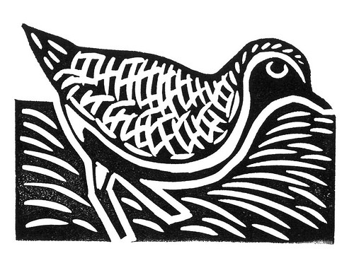
Tuesday, October 16, 2018

Printing Processes

Image result for relief printingPrinting Processes

Relief Printing

Ink is applied to the surface, but not on any sunken areas on a plate or block. You may also chip away parts of the block/plate that you would like to be white instead of black.

Steps to making a Wood Cut Relief Painting:
• Tone/stain Wood block
• Transfer image to wood
• Choose white line or black line
• Depending on what you chose, carve out the spots or lines you want to be white


Intaglio Printing

Image result for intaglio printingScratching or moving metal on a plate. Many different tools may be used to create different textures on the plate. 

Steps to making an Intaglio Printing:
• Carve your design into a plate
• Paint ink over the entirety of the plate
• Use lengths of Scrim to twist on the ink and make a thin texture
• Clear area off around the subject of the drawing
• Soak special printing paper in water for a small amount of time
• The image can now be printed on the paper.

Lithography Printing

Image result for lithography printing exampleA printing process that resolves around grease and water resisting each other. Drawn with grease on a stone.

Steps to making a Lithography Printing:
• Grain down your stone
• Draw on the stone using any greasy material, such as a lithographic crayon
• Chemically treat the stone with Gum Arabic, Rosin, and Talc
• Wash out the stone and drawing
• The stone is now ready to be printed


I would be interested in making an Intaglio print, because it sounds like an exciting profess plus I think the outcome of the design looks nice. I believe these printing processes have influenced designers to design prints based on how the printing processes produce the images.

Friday, October 12, 2018

e-Com Panorama Narrative

Panorama Narrative

        I have designed a Panorama including 9 different pictures of various lighting spots that my Mom designs. Many of these shots were taken at night or close to it. The lights always illuminate the streets or parks they are placed by. Especially during the night time. 
        Many of these pictures were taken during a cold period, mostly because night time was approaching. I remember going and admiring many of these light projects, that or sleeping in the car waiting to leave.
        These scenes have usually been calm and quiet, as well as being cold. I remember this shot of the bridge had a variant during December. there was snow on the ground and colorful lights everywhere making it even more beautiful. 
        I think I put the pictures together well in this Panorama. There are some things I would like to fix, but the way I executed them was the best I could think of. Overall I am proud of this project. It does a good job showing off my theme of lighting. Putting the pictures together really brought back memories, mostly of sleeping and not knowing what was going on at the time, but still memories. This panorama expresses how the future is looking pretty bright. 


e-com Procedures VIdeo Project

Procedures Project

        For this assignment, my group decided to make a video on what to do during a fire drill. The process throughout this project started with the planning. We created a storyboard putting together all of the ideas we had each come up with. We then scouted locations for recording on one day. The next few class periods we recorded the different scenes. Eventually we got to editing, where we spent a few days working until we shared our final products with the class. 
         I was one of the 4 actors in the production. I acted as a student, which wasn't too hard considering I'm a student anyways. Along the way I learned a lot about camera shots and how to use them. I also learned about some effects with Premier Pro, since I was experimenting with many different effects. I also learned a lot about collaboration and how to work as a team, which is something extremely valuable when working on projects as, well... a team. 
        Next time I would like to not have to speed up the shots as much. We had too many shots for the 30 second mark so I had to speed them up so they would fit. Something I would do the same is the shots I took. I felt like they told the story well, they just needed to not be so long. 

Monday, October 1, 2018

e-Com Photoshop POP Art

Photoshop POP Art

When I started this project, I messed with many different filters to try to make the image look good. I eventually decided on the cutout filter, making the image look more cartoon-like. I thought this made the image look better, however it messed with a lot of the shadows and made the image of my subject look scarier then it as meant to be. The background was the hardest part for me, because I had no idea for a while what to do, and eventually just made some custom shapes and threw them together.  
For the colors, I decided to use the colors the target originally had, just not as detailed. I thought the colors worked well together, though the skin tone was a bit brighter in the final product then I hoped for it to be. This was one issue I had with the cut out filter, which messed up some of the coloring in the image. 
I was inspired by Andy Warhol's art style. However the cut out filter made the subject look less like an Andy Warhol POP art subject. My original image colors were inspired by his colors, with the pinkish skin and brightly colored hair, but I later changed that. 
While editing the original photo, I used many tools, the most used being the brush tool. I first used the black and white filter after cutting out the background. I then just used the pen tool on a separate overlay layer to draw over the original image, bringing different colors back to the image.

The Final e-Comm blog post

 The final e-Comm Blog Post Personal Reflection The 5 Guarantees  I had never used an Adobe product, or any decent film equipment before goi...